Student Notable
Packaging Award
Core77 Design Awards 2018
FRENCHIES craft beer PACKAGING
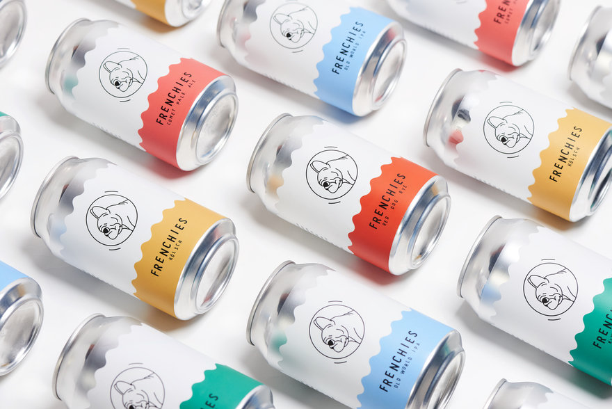
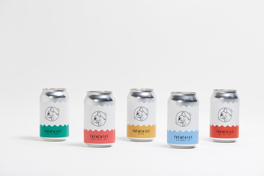
A collaboration with frenchies bistro and brewery to rebrand their entire product range. focusing on an honest, modest aesthetic whilst celebrating materiality and the aluminium can as a packaging vessel and looking to cultivate a new recycling culture using the recently government implemented (New South Wales state) container deposit scheme. The design aims to reflect the ethos of the brewery and restaurant honest, simple, quality.


Aluminium is a fantastic material, and often can designs hide the raw beauty of it, it can be easily forgotten that it is a precious and valuable; once covered in plastics and inks. We wanted to keep the design honest which is reflective of the ethos of the brewery and the bistro, all whilst on a low cost start up budget.The range needed to speak maturity, honesty and refreshment. People can identity with brands aesthetics and stories and the 'frenchies' ethos is about honesty and quality. The can design needed to be about the contents and nota lifestyle.
The 'Beer here not here' logo comes from a desire to incubate a new recycling culture within new south wales since the implementation of the containerdeposit scheme. This culture is already prevalent in European countries such as Germany, where it is common practice to place containers with a deposit value next to bins for others in need. It allows people in need to earn some basic income and ensures that recyclable materials are processed correctly and not contaminated with other waste materials.
For hi resolution photos please use this link
https://www.dropbox.com/sh/at62zu9ozh9jxpm/AACmSQ0dTJZSbDjsVpq6UR0ia?dl=0