Student Runner Up
Visual Communication Award
Core77 Design Awards 2015
My Mom's Kitchen
The briefing was to generate 300 information about a place and then create a typographic poster to describe it. The place is my Mom's kitchen. On the top, there is information related to time passage. Next to it, there are the objects from the kitchen associated with those time elements. The lines direct these objects to emotions I have when I am at that place. The big kerning on the bottom shows the abstract quality of my feelings compared to the other concrete information about the kitchen.
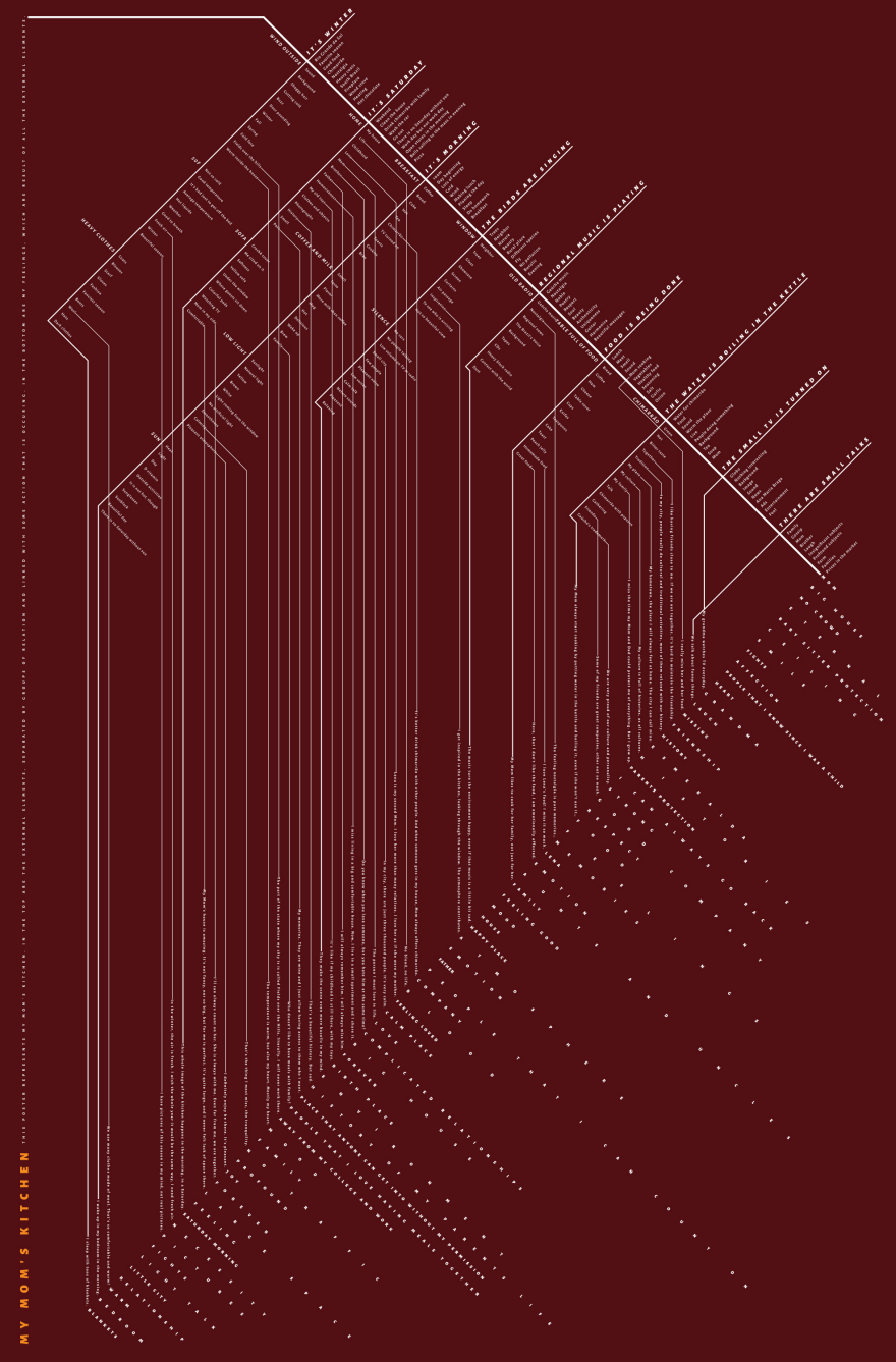
The infographic tells a story about me in my Mom's kitchen. First, I generated 30 information about the place. From each of these 30 elements, I created more 10 related information. With all the 300, I found a logical relationship between them that shows how they belong to each other, first with big groups and then with individuals. The result was the description of how I react when I am there, how I interpret that environment. The time elements on the top mean information about periods, like seasons, little things happening, actions. Right on their left side, I put objects or things that have direct relationship with them, things that remember me those time frames. From these elements, the lines depart and go to other information that represent strong emotional meaning for me. Some words are the feeling itself, other are anything that cause me emotion. The big kerning shows the flow and the abstract quality of feelings compared to physical objects. The biggest challenge of this project was to transform a complex conceptual relationship of elements into a visual composition that tells a story before the public can read the information. To accomplish that, I chose a color that transmit the warmth of the place. Also, I designed a composition that guides the reader from the title, on the bottom, explaining what the project is, that goes to the external things of the environment and then to my reactions to those things, as it actually occurs.
Jury Commentary
clever and full of sentiment